A services page that lists what you do without explaining why it matters is just a menu. Visitors need enough information to decide whether you're the right fit before they reach out.
Why Most Services Pages Don't Work
The typical services page has two problems.
The first is vagueness. Service descriptions that read like "I help you unlock your potential and achieve your goals" tell the visitor nothing. They don't know what you actually do, how the process works, or what the outcome looks like.
The second is friction. Some services pages require visitors to click through multiple pages just to understand what's offered. Others hide pricing entirely, forcing every potential client into a discovery call before they can evaluate basic fit. Some visitors are happy to book a call. Many others will leave and find someone who gives them the information upfront.
A good services page sits between those extremes. Enough detail to inform a decision, not so much that it overwhelms.
What to Include for Each Service
Every service listing on your page should cover these elements:
A Descriptive Name
Call the service what it is. If you're a therapist offering couples counseling, call it "Couples Counseling." If you're a creative agency doing brand identity work, call it "Brand Identity."
Branded service names ("The Clarity Method" or "The Signature Experience") might feel distinctive, but they force visitors to read the description just to understand what the service actually is. Use plain language first. You can add a branded name as a subtitle if it matters to your positioning.
Who It's For
One or two sentences identifying the ideal client for this service. This helps visitors self-select and signals that you understand their situation.
A bookkeeper might write: "For freelancers and solo business owners earning $75K–$500K who need monthly bookkeeping and quarterly tax estimates." A therapist might write: "For adults navigating anxiety, life transitions, or relationship challenges."
What's Included
List the tangible deliverables or components of the service. If you're a web designer, that might be a sitemap, wireframes, two rounds of revisions, and a launch-ready site. If you're a consultant, it might be a 90-minute strategy session, a written action plan, and 30 days of email follow-up.
People want to know what they're getting. Vague descriptions like "a comprehensive approach tailored to your needs" don't answer that question.
The Outcome
What changes for the client after working with you? This is where you connect the service to the result. Not in hype-driven language, but in concrete terms.
A bookkeeper might say: "You'll have clean books, timely reports, and a clear picture of your cash flow every month."
A therapist might say: "Clients typically leave with practical strategies they can use between sessions and a clearer understanding of the patterns driving their challenges."
Pricing (or a Range)
This is where most service providers hesitate. The concern is usually that listing prices will scare people off or that projects vary too much for a fixed number.
Both are legitimate concerns. But there's a middle ground:
Approach
Example
When It Works
Fixed pricing
"$150/session"
Standardized services with consistent scope
Starting price
"Projects start at $3,000"
Variable scope with a defined minimum
Price range
"$2,500–$7,500 depending on scope"
Projects that vary significantly
Investment context
"Most clients invest $500–$1,500/month"
Retainer or ongoing services
Any of these give the visitor enough information to self-qualify. If your prices are significantly higher than average for your industry, a starting price is especially useful because it filters out poor-fit inquiries before they reach your inbox.
If you genuinely can't list any pricing, at minimum explain why and tell visitors what determines the cost: "Pricing depends on the number of pages, custom functionality, and timeline. I'll provide a detailed quote after our initial consultation."
A Call to Action
Every service listing should end with a clear next step. Link to your contact form, a scheduling tool, or whatever intake process you use.
Don't make the CTA generic across all services. If couples counseling starts with a free phone consultation but individual therapy starts with an intake form, the CTA for each should reflect that.
Stay in the loop
New templates + tips, in your inbox.
No spam, ever. Just an occasional note when a new template ships or there's a tip worth sharing.
Page Structure on Squarespace
There are two common layouts for services pages on Squarespace 7.1, and the right one depends on how many services you offer.
Layout A: Single Page with Sections
If you offer two to five services, put them all on one page. Each service gets its own section with a heading, description block, and CTA button. Use Squarespace's section dividers or alternating background colors to visually separate them.
This approach keeps everything scannable. Visitors can compare your offerings without navigating away.
Layout B: Overview Page with Sub-Pages
If you offer more than five services or if each service needs detailed explanation, create a top-level services page that summarizes each offering in a short block, then link each block to a dedicated sub-page with the full description, pricing, and CTA.
In Squarespace, you can create these sub-pages as nested pages under a main "Services" folder in your navigation. The overview page acts as a routing tool; the sub-pages do the heavy lifting.
Design Considerations
Use consistent formatting. Every service listing should follow the same structure. If one service has a bulleted list of deliverables, they all should. Inconsistent formatting makes your page harder to scan and signals a lack of attention to detail.
Give each section breathing room. Cramming three services into a single screen makes none of them readable. Use generous padding between sections. On Squarespace, adjust section padding to at least medium or large.
Use anchor links for long pages. If your single-page layout has five or more services, add anchor links at the top so visitors can jump to the one they're interested in. The process for creating anchor links on Squarespace involves adding a URL slug to each section and linking to it with a # prefix.
Add testimonials inline. Instead of putting all your testimonials on a separate page, drop one relevant quote beneath each service. A testimonial from a couples counseling client under your couples counseling section is far more persuasive than a page of mixed reviews.
What to Skip
Service comparison tables for wildly different offerings. Comparison tables work well for tiered versions of the same service (Basic, Pro, Premium). They don't work when you're comparing unrelated services like "Brand Strategy" and "Social Media Management." Use tables for tiers, sections for distinct services.
Lengthy process explanations on the services page. A brief mention of your process is fine ("Here's how it works: 1. Discovery call, 2. Proposal, 3. Kickoff"). A 500-word breakdown of every phase belongs on its own page or in a blog post. The services page should focus on what visitors get, not on your internal workflow.
Jargon. If your service descriptions use language that only people in your industry would understand, rewrite them. Your clients don't know what "a holistic, integrative, client-centered modality" means. They know what "therapy that helps you build practical coping skills" means.
Testing and Refining
After your services page is live, watch two metrics:
Click-through rate on CTAs. If visitors are reading the page but not clicking your buttons, the issue is usually either unclear next steps or missing pricing. Try making your CTA more specific or adding pricing context.
Inquiry quality. If you're getting a lot of inquiries from people who aren't a good fit, your service descriptions or pricing signals may be too vague. Adding a "who this is for" line and a starting price will help filter inquiries toward better-fit prospects.
Start Building
A services page that does its job should reduce the number of "just checking in to see what you offer" emails and increase the number of "I've read your services page and I'd like to move forward" messages. Clarity on your services page is respect for your visitor's time.
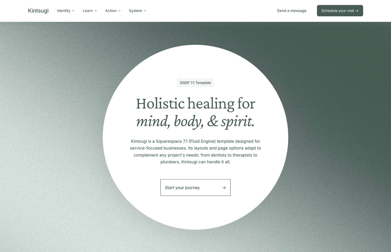
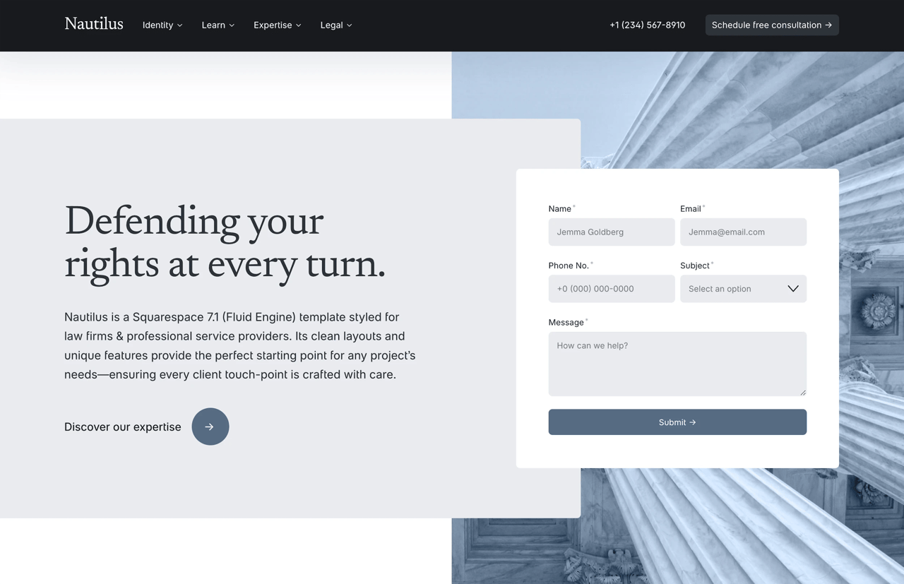
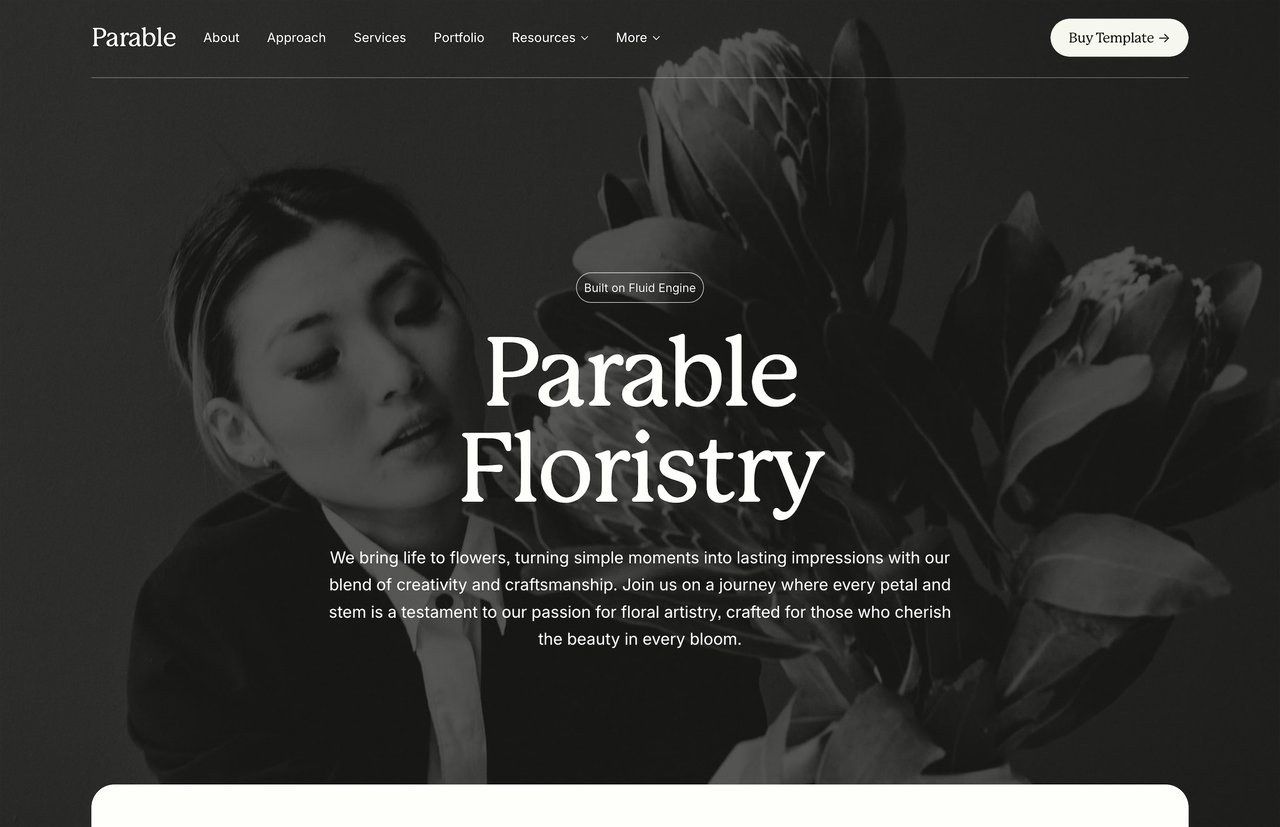
If you're building a services page on Squarespace and want a head start, Studio Mesa templates include pre-designed services pages with structured layouts for descriptions, pricing, and CTAs. Kintsugi is built for therapists and wellness practitioners, Parable for small businesses and consultants, and Nautilus for law firms and professional services. Each template ships with 15 pages and an unlimited license. Browse the full lineup in the template shop.