What You Need Before You Start Building
Before you open Squarespace, you need three things figured out: what your business does, who it serves, and what you want visitors to do on your site.
That might sound obvious. But most small business websites fail because the owner jumped straight into design without answering those questions first. The result is a site that looks fine but doesn't communicate anything specific.
Get Clear on Your Offering
Write a single sentence that describes what your business does and who it helps. Not a tagline. Not a mission statement. Just a plain, direct sentence that a stranger could read and immediately understand.
Examples:
"I'm a bookkeeper who helps freelancers and small creative agencies manage their finances."
"I run a residential landscaping company in Austin that specializes in native plants and drought-tolerant design."
If you can't write that sentence, you're not ready to build a website. You're ready to clarify your business.
Gather Your Content
You'll need the following before you start:
A clear description of your services or products
5–10 high-quality photos (of your work, your team, or your space)
A short bio or "about" section
Contact information and your preferred method of inquiry
Testimonials or reviews, if you have them
Your logo and brand colors, if they exist
You don't need all of this to be perfect. But having it ready will keep you from stalling mid-build.
Choose a Squarespace Plan
Squarespace offers several tiers. For most small businesses, the Business plan is the right starting point. It gives you access to custom code injection, advanced analytics, and promotional pop-ups. If you're selling physical or digital products, you'll want the Basic Commerce plan for transaction features without the 3% fee.
Don't overthink this. You can always upgrade later.
Pages Every Small Business Website Needs
One of the most common questions I hear is "how many pages should my site have?" The answer depends on your business, but most small businesses need between 5 and 10 pages. The goal is to give visitors enough information to make a decision without overwhelming them. If you want to go deeper on this topic, I wrote a dedicated article on how many pages your Squarespace website should have.
Here's the core set:
Homepage
Your homepage is the front door. It needs to do three things within the first few seconds:
Tell visitors what you do
Show them you're credible
Give them a clear next step
That means a strong headline, a brief value statement, and a prominent call-to-action button. Don't bury the important stuff below three image carousels and a mission statement. Put the essential information above the fold, then use the rest of the page to support it with testimonials, service highlights, and a secondary CTA.
About Page
This is consistently one of the most-visited pages on any small business site. People want to know who they're working with.
Write your about page in second person where possible. Start with the visitor's problem or goal, then transition into who you are and why you're qualified to help. Include a photo of yourself or your team. Skip the timeline of your career unless it's directly relevant to your credibility.
Services Page
List your services with enough detail that someone can self-qualify. Each service should include a brief description, who it's for, and what the outcome looks like. If you offer tiered pricing, consider a simple comparison table.
Don't make visitors click through four pages to understand what you charge. Transparency builds trust faster than mystery.
Contact Page
Keep your contact page simple: a form, your email address (or phone number if appropriate), and your location if you serve a local area. Squarespace's built-in form blocks work well for this. Customize the fields to collect the information you actually need. If you want to go further with form design, there's a detailed guide on creating contact forms that convert.
Avoid adding too many fields. Name, email, and a message box are usually enough. Every extra field reduces the likelihood someone fills it out.
Blog or News Page
A blog isn't mandatory, but it's one of the best tools for long-term organic traffic. Even publishing one post per month on a topic your customers search for can build meaningful visibility over time. If you're going to blog, commit to a sustainable pace. One good post a month is better than a burst of five posts followed by six months of silence.
The complete guide to Squarespace SEO covers how to structure blog content for search visibility.
Setting Up Your Squarespace Site
Pick a Template (or Start from Scratch)
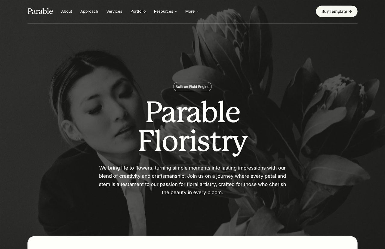
Squarespace 7.1 uses the Fluid Engine, which means every template is fully customizable. You're not locked into a layout. That said, starting with a template that's close to what you need will save you hours of work.
When evaluating templates, look for:
Feature | Why It Matters |
|---|---|
Page count | More pages = more structure out of the box |
Navigation style | Does the nav feel clean and intuitive? |
Typography | Are the default fonts readable and professional? |
Mobile layout | Does it look good on a phone without heavy tweaking? |
Content blocks | Does it use sections and layouts you'll actually need? |
Free Squarespace templates give you a starting point, but they're intentionally generic. They work for everyone, which means they're optimized for no one. If you've read the breakdown of premium vs. free Squarespace templates, you know the difference often comes down to structure, page count, and how much time you spend customizing.
Configure Your Site Settings
Before adding content, handle the foundational settings:
Site title and tagline. Your site title appears in browser tabs and search results. Make it your business name plus a short descriptor. "Cedar & Co. | Brand Strategy for Small Businesses" is more useful than just "Cedar & Co."
Favicon. Upload a small square version of your logo. It's a small detail that makes your site look polished.
Social sharing image. Set a default image that appears when someone shares a link to your site on social media. Squarespace lets you set this under Marketing > Social Sharing. Use a clean, branded image at 1200×630 pixels.
Custom domain. Connect a custom domain as early as possible. Squarespace walks you through this in the Domains panel. If you don't have a domain yet, purchase one through a registrar like Namecheap or Cloudflare, then connect it to your Squarespace site.
Design Decisions That Matter
A few design choices will shape how professional your site feels:
Fonts. Stick to two typefaces max. One for headings, one for body text. Squarespace includes a solid library of Google Fonts and Adobe Fonts. Prioritize readability over personality. If you want to go beyond the defaults, here's a guide on using custom fonts on Squarespace.
Colors. Use your brand colors if you have them. If you don't, start with a neutral palette: a dark color for text, a light background, and one accent color for buttons and links. Squarespace's color theme system makes this easier to manage across your whole site.
Spacing. Give your content room to breathe. Squarespace's section padding controls let you adjust vertical spacing between blocks. More white space almost always makes a site feel more professional.
Images. Use real photos when possible. Stock photos are fine as placeholders, but nothing builds trust like seeing actual photos of your work, your team, or your space. Compress images before uploading to keep page load times fast.