Design
1 → Don’t fear white space
It’s hard to focus on a wall of content—let your design breathe.
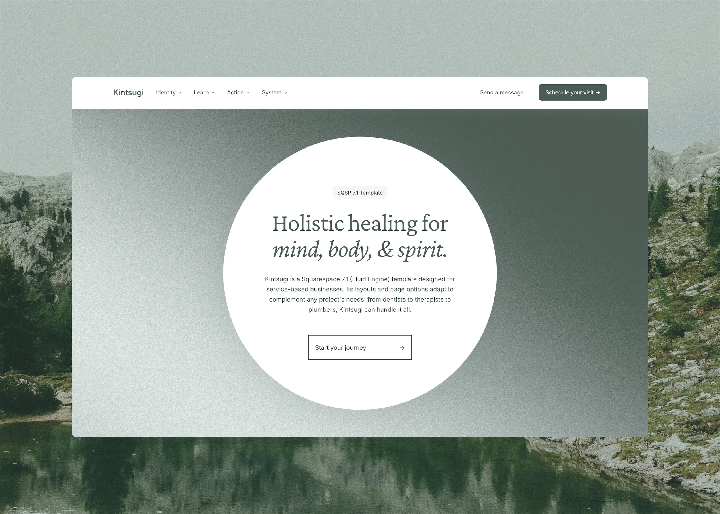
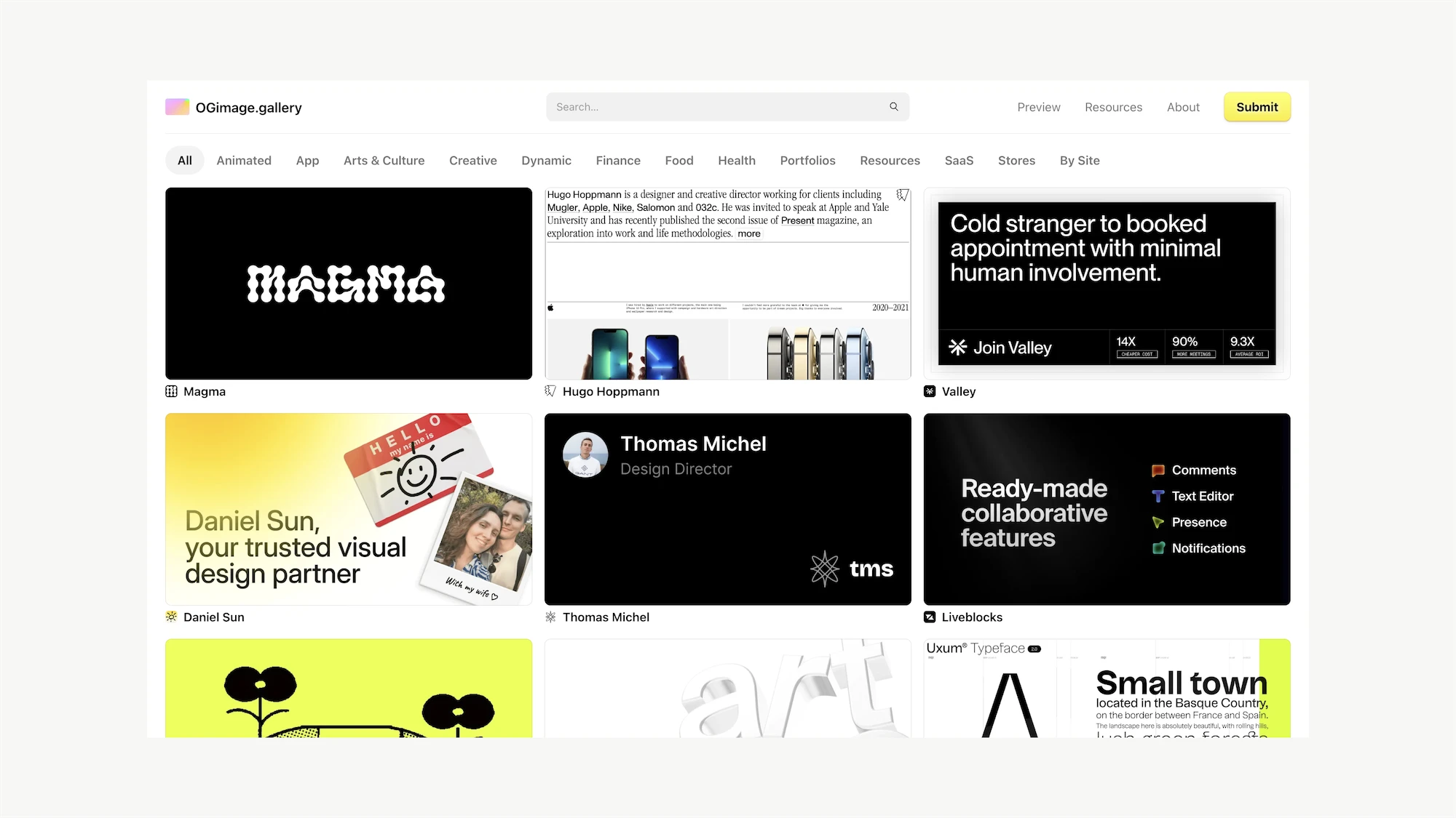
You don’t need to fill every pixel with something for the site to be compelling and clear. The practice of removing non-essential parts of your site, both visually and content-wise, can drastically improve effectiveness. Check out Dead Simple Sites, Minimal Gallery, and Site Inspire to get the courage to remove the fluff.
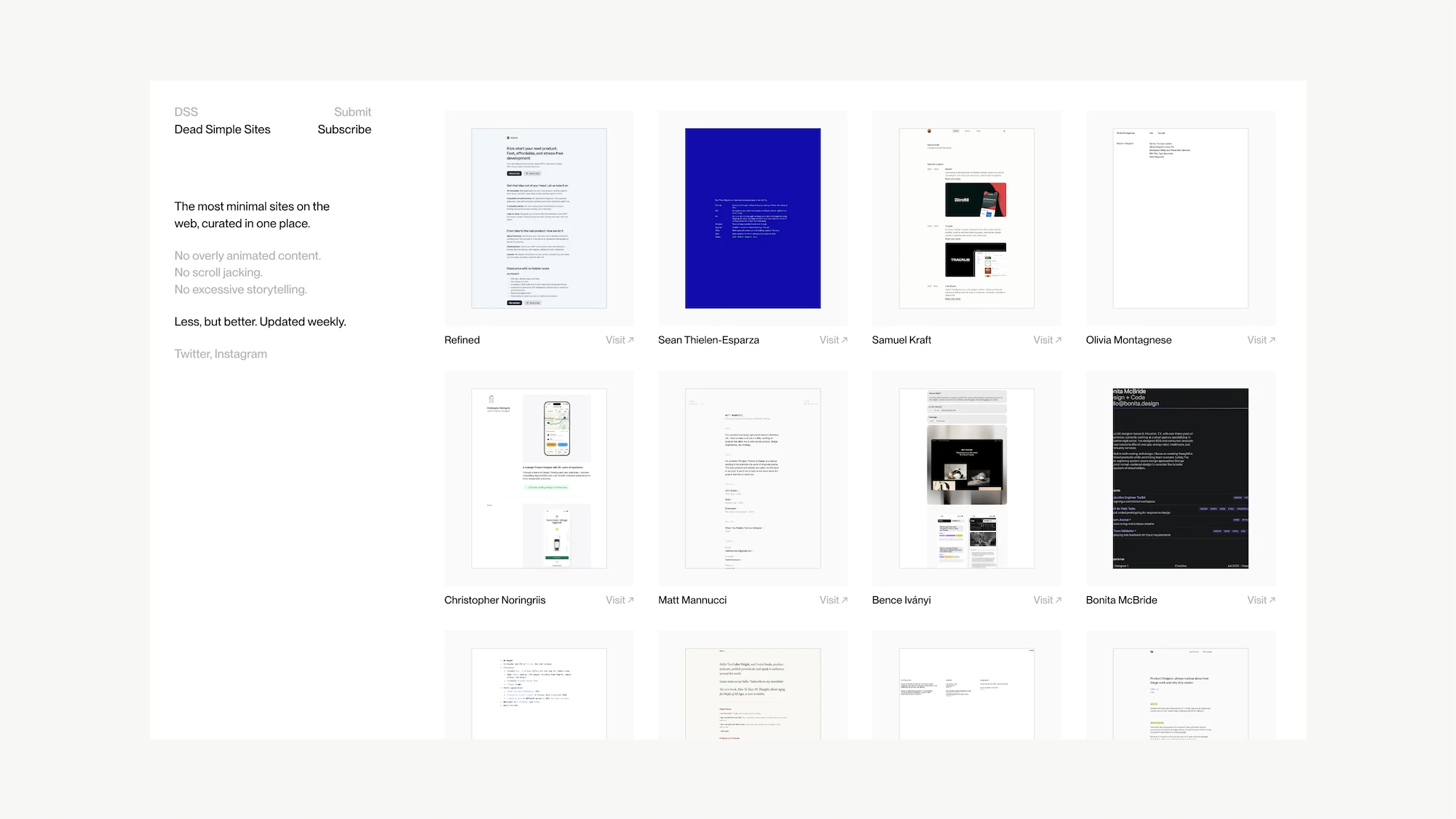
Dead Simple Sites curates some incredible minimalist sites.
2 → Match color themes to the label
It sounds silly, but needs to be said: Use light colors for “White” and “Light” color themes, and use dark colors for “Dark” and “Black” themes. Using a lime green in “Black” will absolutely cause issues across the site. The “Bright” color is up to you, but always make sure to prioritize legibility and accessibility when using strong colors.
Have a bunch of colors in your brand and don’t know how to make it work within the defined themes? Just use a Shape Block to cover a section! Any text that isn’t legible can easily be updated directly within the editor as well.
3 → Consistent Fluid Engine grid columns
Small inaccuracies add up to create a feeling of unease when visiting a website, even if they aren’t immediately perceptible. One of those things is the grid gap on Fluid Engine.
Personally, I use “no gap” for most sections, then something like 20 (width) / 10 (height) for any sections like a centered 3-item grid that needs more space between items. Just make sure any other sections that aren’t “no gap” use those same settings to maintain perfect visual alignment.
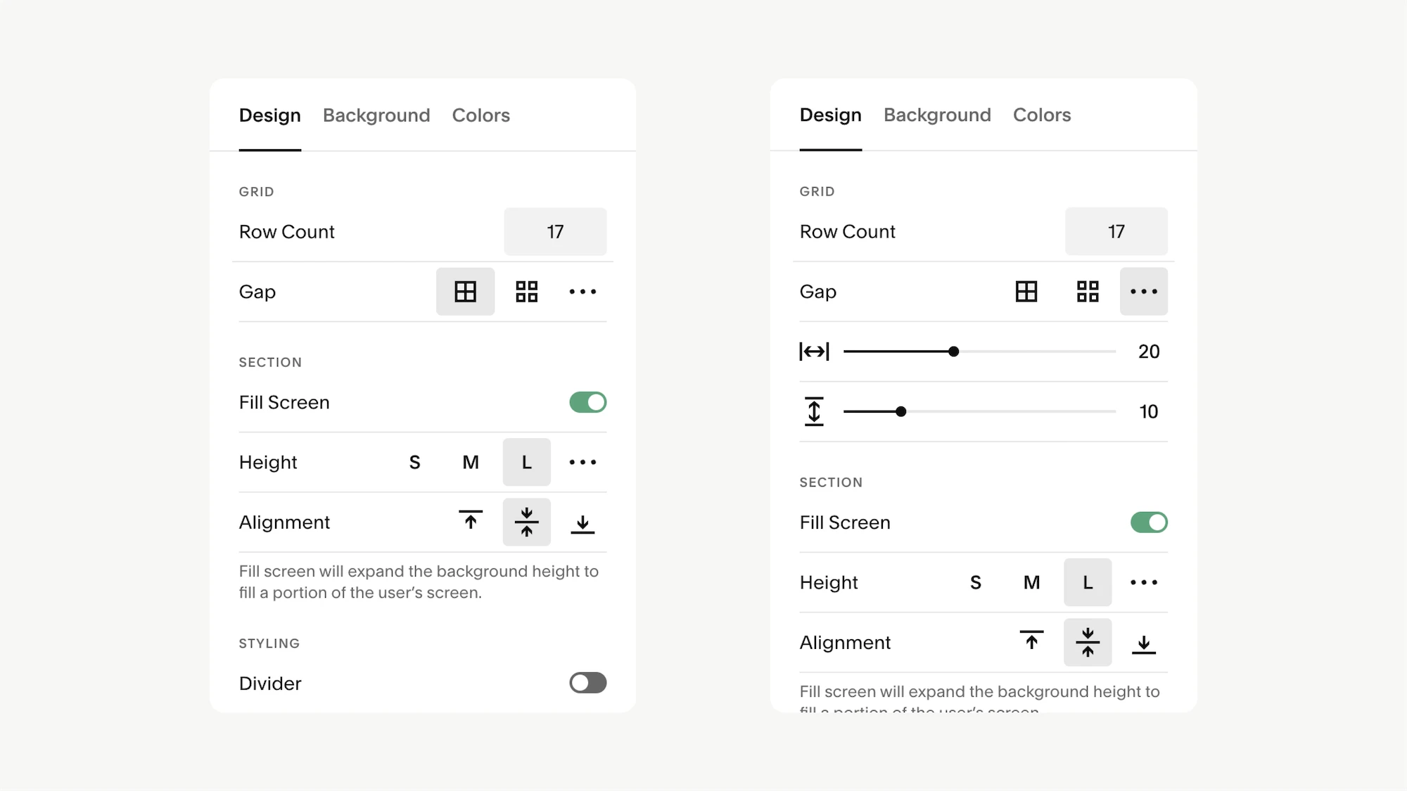
"No gap" or 20 (width) / 10 (height) for sections
4 → One page > ten one-section pages
One-page websites are extremely underrated! Instead of having 10 pages with minimal content on each, compile them into a single page and use Anchor Links to navigate. You’ll also find it’s much easier to prioritize certain content (read: delete the fluff) when it’s all part of one fluid page.
Need inspiration? One Page Love is my go-to, and showcases some of the best one-pagers on the internet.
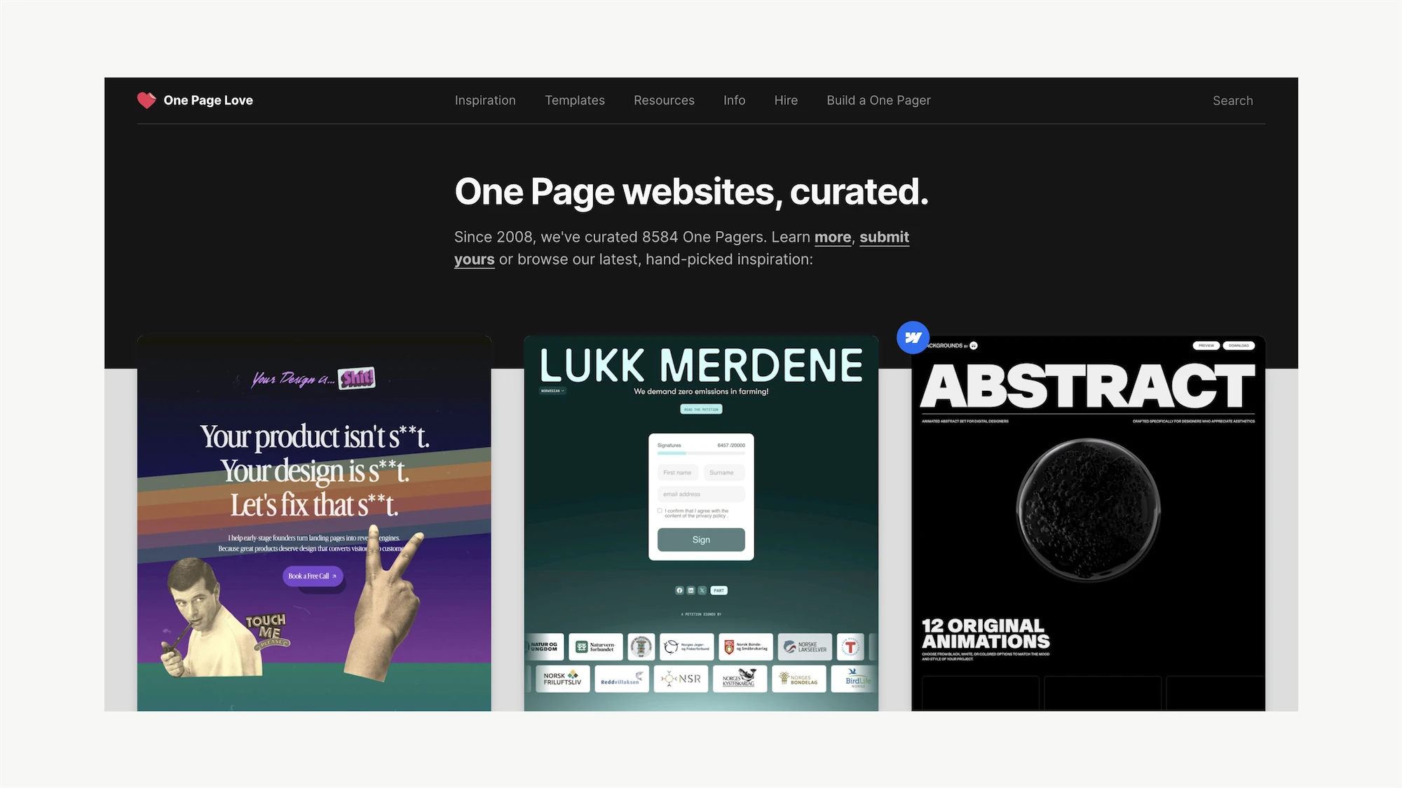
One Page Love is an amazing resource for single-page site inspiration.
5 → Use a quality blog layout
For some god-forsaken reason, Squarespace includes the “Wide” layout option within blogs, making it possible to have posts that are 1200px+ wide… which is a terrible reading experience. And yet, I’ve seen plenty of sites that use this setting! Choose “Narrow” for 95% of situations.
But, shameless plug: (almost) all Studio Mesa templates come with a killer blog layout that’s proportioned correctly, has a readable width (that’s responsive on mobile), and a bunch of other features like a social sharing section and list of “continue reading” posts. If you’re going to spend the effort blogging, at least make it legible.
6 → Only two typefaces, no exceptions
Introducing a third, fourth, or fifth typeface on your site not only slows down the site—but it’s almost always just a terrible idea design-wise. Pick an amazing serif for headlines and a sans serif for your body font and stop there. Or just sans serif if that’s what suits your brand!
Not two serifs… not two sans serifs… one sans, and one serif.
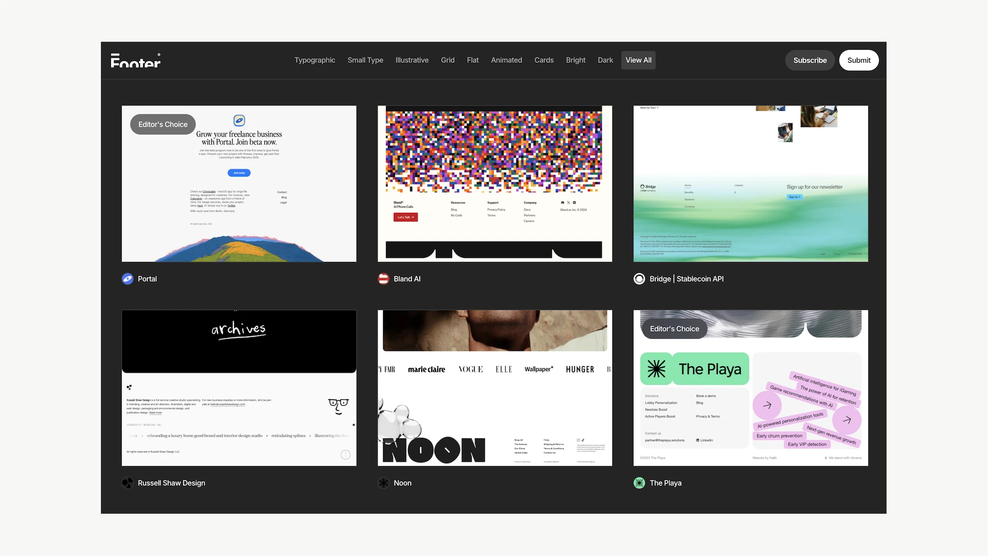
7 → Make your footer shine
Hot take: Footers are vastly underrated and underutilized for flexing some creativity. Almost nobody cares about the footer, which gives you license to do something fun! Add the links you need and that (seemingly) mandatory newsletter signup, but then go to town with layouts and styles.
Need inspiration? Check out Footer Design to get some ideas for making your site’s footer a work of art.
8 → Customize mobile browser top color
Want to give the mobile version of your site a pop of color (or just make it match your brand)? Add this to the Header Code Injection and change the “content” hex value to whatever color you want—this fills in the top bar of phones where the time, battery, wifi, etc. are displayed.
<meta name="theme-color" content="#ffffff">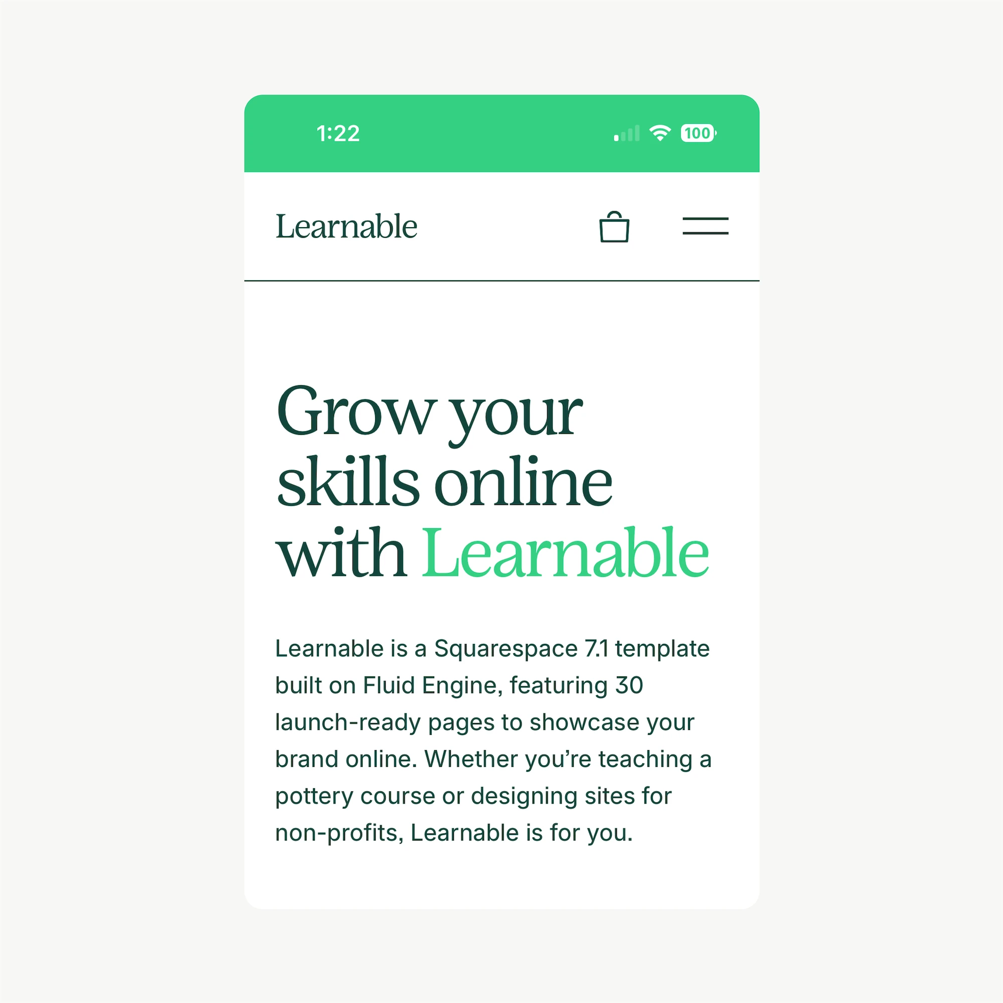
9 → Adjust mobile typography in CSS
Squarespace ~still~ doesn’t allow you to set typographic settings for the mobile version of your site—which is important for making everything scale properly. The three main values you want to change are the font size, letter spacing, and line height. Add this to the Custom CSS window and adjust to taste.
/*Mobile Heading Adjustments*/
@media screen and (max-width:800px){
H1{
font-size: 30px;
letter-spacing: -.01em;
line-height: 1.3;}

H2{
font-size: 24px;
letter-spacing: -.01em;
line-height: 1.3;}

H3{
font-size: 18px;
letter-spacing: 0em;
line-height: 1.3;}}
10 → Emulate sites you admire
There are so many incredible websites on the internet, many of which are not built on Squarespace—and many that are built by teams of insanely talented people. Instead of limiting your style and capacity to what you already know, look to the sites that inspire you to push your skills and build something cool!
You’ll likely run into platform limitations, and certainly shouldn’t copy a site 1:1, but… look for high-level things you can emulate: Page flows, imagery presentation, color combinations, text styling, and more. You’ll only grow as a designer if you push your creativity, and that happens through exploration. Let this be the year you expand your style by practicing what makes you uncomfortable (but inspired).
Imagery
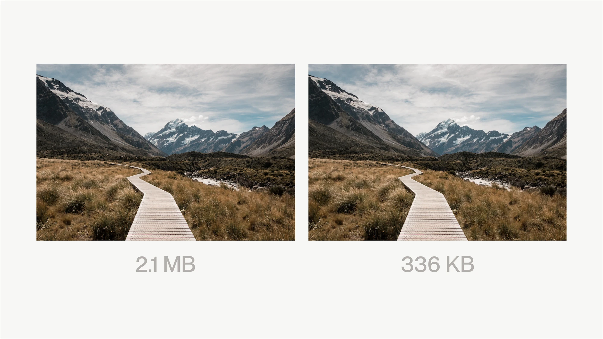
11 → Compress your images (properly)
Look, Squarespace sites are slow—it’s just a fact. There’s a bunch of code that loads to make the editor work, and that slows down the load time (among other things out of your control). This is okay and doesn’t really make that much of a difference to users or Google in ranking your site.
But, y’know what does make a difference? When images take 3+ seconds to load as you scroll. Use Optimage to make images as compressed as you’re able to. There are a million free compression tools—this one works the best, as it compresses images with minimal loss in visual quality.
My general benchmark is around 500KB for most images, and 1MB max if it’s something like a full-screen background with a lot of detail that needs to be preserved. Things like blog images that only display in a 300px x 100px card can easily be under 100kb when resized and compressed properly.
12 → Scroll down 5+ times on Unsplash
I know that perfect image of a “business man smiling in an office” looks great and would do just the trick… but there’s a reason it’s at the top of the list. Literally hundreds (probably thousands) of other websites have that same business guy on their website! There are PLENTY of great images on the internet to pick from, so don’t settle on the low-hanging-fruit.
At a minimum, scroll down Unsplash at least 5+ times before even starting to consider an image for your site. I’ve also had great luck with Pexels if you want a more natural-looking shot.
13 → Use AI imagery with care
Let’s be real: AI is getting scary good at making real-looking pictures, even in nuanced scenarios. I think we’ll see images in 2025 that are completely indiscernible from reality, even to the most well-trained eye.
…but you still have to put a little effort in to get good results. There are a lot of tools out there now, but many still require some insider knowledge about prompting and styles. My favorite has been Visual Electric—you can get incredible results with really their straightforward, Figma-like interface options. I personally love the embroidery setting.