What a church website actually needs to do
Think about the people visiting your church's website. Some are first-time visitors trying to figure out if your church is right for them. Some are regular members looking for this week's sermon, group schedule, or event registration. Some are parents checking whether you have a kids program before they commit to visiting. Some just want to give.
Each of those people needs to find what they're looking for quickly, without clicking through five pages or guessing where things are hidden. A church website that only has a homepage, an about page, and a contact form leaves most of those people stranded.
The goal is to build a site that functions as an always-available extension of your church, not a placeholder between Sundays.
The pages your church website should include
Every church is different, but the majority need more pages than they think. Here's the core set, along with what each page should accomplish.
Homepage
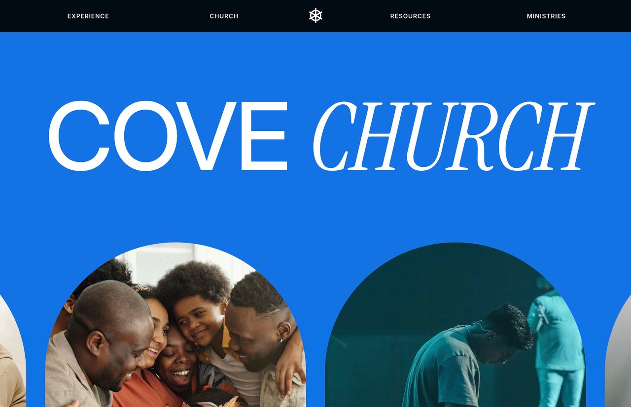
Your homepage sets the tone for everything. A first-time visitor should be able to answer three questions within a few seconds of landing: What kind of church is this? When and where do you meet? How do I take the next step?
Lead with something human. A strong photo of your community, a clear headline about your mission, and a visible button for new visitors ("Plan Your Visit" or "What to Expect") does more than a slideshow of event graphics ever will.
Keep the homepage focused. It's a gateway, not an encyclopedia. Link out to deeper pages rather than cramming everything onto one scroll.
Sermon archive
For many church members, this is the most-visited page on the site. People miss Sundays. Visitors want to hear the teaching before they show up. Small group leaders reference past messages during the week.
Structure your sermon archive so people can browse by series, date, or speaker. Embed video directly on the page (YouTube or Vimeo both work with Squarespace) and include sermon notes or discussion questions if your church produces them. A blog-based layout works well here since Squarespace's blog functionality supports categories, tags, and chronological browsing out of the box.
Online giving
Online giving should be effortless. If someone has to hunt for the donate button or navigate away from your site to a third-party platform, you're adding friction to an act of generosity.
Squarespace has a built-in donation block that supports one-time and recurring gifts through Stripe or PayPal. You can set suggested amounts, create multiple funds (general, missions, building, benevolence), and customize the receipt donors see after giving.
The donate button should be visible on every page of your site, ideally in the main navigation or the footer. Don't make people search for it.
If your church uses a third-party giving platform like Tithe.ly, Donorbox, or Givebutter, you can embed their forms directly into a Squarespace page so the experience still feels seamless.
Groups and community
Most churches have some version of small groups, city groups, life groups, or community groups. These are often the real entry point into church life, and they deserve more than a passing mention on your homepage.
Create a dedicated page that explains what groups are, how they work, when they meet, and how to sign up. If your church has multiple types of groups (men's, women's, young adults, neighborhood-based), organize them with clear categories so people can find what fits.
For signups, a simple Squarespace form works. If you use a church management tool like Planning Center or Church Center, link directly to the relevant signup page.
Kids and family
Parents will check your kids program before they visit. That's just how it works. If they can't find clear information about what you offer for children, how check-in works, and what safety protocols are in place, many won't come.
A dedicated kids page should cover age ranges, what a typical Sunday looks like for kids, your approach to safety and check-in, and how to register. Photos of real kids ministry environments (with appropriate permissions) go a long way toward making parents feel comfortable.
Events
Church life runs on events: services, conferences, volunteer days, community outreach, holiday gatherings, baptisms. An events page keeps everything in one place and gives your congregation a single URL to check.
Squarespace doesn't have a built-in event calendar that matches what most churches need, but you can build a solid events page using a blog layout (one post per event, sorted by date) or embed a third-party calendar. Keep each event listing focused: what it is, when it is, where it is, and how to sign up.
About and beliefs
First-time visitors want to know what your church believes, who leads it, and what the culture feels like. Your about page should cover your mission, your values, and your leadership team. A separate beliefs or doctrine page can go deeper for those who want it.
Write in plain language. Avoid insider terminology that only makes sense to people already in church culture. Someone checking out your beliefs page might be visiting a church for the first time in their life.
Plan your visit
This is one of the highest-value pages on a church website, and many churches don't have one at all. A "Plan Your Visit" or "New Here" page removes every barrier to showing up for the first time.
Cover the basics: where to park, which door to enter, what to wear, how long the service lasts, whether there's coffee, what the kids program looks like, and what to expect from the actual service. A short video walkthrough of a Sunday morning is even better.
The tone here matters. Be warm and specific. "Come as you are" is nice sentiment but doesn't tell someone where the parking lot is.
Blog or news
A blog serves two purposes for a church: keeping your congregation informed and building organic search visibility. Weekly updates, sermon discussion guides, ministry highlights, and event recaps all work.
From an SEO perspective, blog posts targeting local searches ("churches in [city]," "Christmas Eve service [city]," "youth group [city]") help new people find you through Google. One post per week is plenty to build momentum.
Contact
Simple and clear. Address, phone number, email, office hours, and a contact form. Include an embedded Google Map so people can get directions with one click.
Design principles for church websites
Warm but not cheesy
Church websites have a reputation for looking dated, overly corporate, or aggressively trendy. The sweet spot is warm, modern, and clean. Think of the feeling you want someone to have when they walk into your building for the first time, and translate that to the screen.
Use real photography of your community wherever possible. Stock photos of diverse groups holding hands in a field don't build trust. An actual photo of your worship team, your lobby, or your kids program does.
Clear navigation
A church website has more moving parts than most small business sites. Sermons, groups, events, giving, kids, beliefs, contact. That's a lot of pages. Organize your navigation with dropdown menus so the top-level menu stays simple (maybe five or six items) while the full depth of the site is easily accessible.
Don't hide critical pages. "Give" and "Plan Your Visit" should be in the main navigation or as a prominent button, not buried three clicks deep.
Mobile-first
A significant portion of your visitors are checking the website on their phone, either on Sunday morning to confirm service times or during the week to look something up. Every page should be tested on mobile. Navigation should be easy to tap, text should be readable without zooming, and giving should work smoothly on a phone screen.
Consistent brand
Your website, social media, print materials, and physical space should feel like they belong to the same organization. Use the same fonts, colors, and photography style across everything. This sounds obvious, but many churches have a polished Instagram presence and a website that looks like it was built in 2014.