What a nonprofit website actually needs to do
Most nonprofit websites have the same underlying problem: they were built to impress funders rather than serve the people who actually visit them.
Grantors and major donors aren't your primary audience. They'll visit, yes, but they usually come already knowing who you are. The people your website needs to reach are different: someone who saw your organization mentioned in a local article, a volunteer wondering if you're a good fit, a first-time donor deciding whether to trust you with $50, a family trying to understand if your programs apply to them.
Those visitors need something different from a board presentation or an annual report. They need to understand your mission in thirty seconds, know that the organization is real and credible, see how they can help or get help, and find an easy way to take the next step.
A nonprofit website that does those four things well will convert more visitors, raise more money, and recruit more volunteers than one that's polished but impenetrable.
The pages your nonprofit website needs
Home
The homepage is where most visitors land first, and the job of the page is simple: orient them and point them somewhere useful. Your mission statement should appear above the fold in plain language—not a tagline, not a vision statement, but a sentence that explains what your organization does and who it serves.
Below that, a simple three-part layout works well for most nonprofits: what you do (a brief program overview), why it matters (a stat, a story, or a short quote from someone you've helped), and a call to action (donate, volunteer, or learn more). Keep this section short. The homepage isn't where you tell the whole story.
The navigation should be simple. Most nonprofit homepages try to do too much with too many links. Four or five top-level nav items is usually enough.
About
This is the most-visited page on most nonprofit websites after the homepage. Donors and volunteers want to know who's behind the organization before they commit to anything.
A strong About page covers the founding story (briefly), the mission and approach, and the leadership team with photos and names. If you have a board, a short list is worth including. If you've been around for a while, a timeline or a few key milestones adds context.
The About page is also where you address the trust question directly. Years in operation, number of people served, certifications or accreditations, third-party reviews from sites like Charity Navigator or GuideStar—these details matter to donors who are deciding whether your organization is real and effective.
Programs or Services
This page explains what you actually do. Structure it around the programs you offer, with each program getting its own clear description. If your programs serve different audiences, organize them that way so visitors can quickly find what applies to them.
Avoid jargon wherever possible. Language that makes sense inside your organization often creates confusion for outsiders. Read each program description as if you've never heard of your nonprofit before.
If you have enough content, each major program can have its own subpage. That structure also helps with SEO—program-specific pages can rank for searches related to that specific type of service.
Get Involved
Nonprofits need two different types of engagement from volunteers: one-time help and ongoing commitment. Some volunteers want to show up for a weekend event and be done. Others want to build something with you over months or years. Your Get Involved page should speak to both.
Include a clear description of volunteer roles, a simple application or interest form, and information about what the commitment looks like. If you run recurring volunteer programs, an FAQ section addressing common questions saves a lot of back-and-forth.
This page is also where you can mention corporate volunteer programs or group volunteer opportunities if your organization can accommodate them.
Donate
The donate page is the highest-stakes page on your site. Every element should remove friction and reinforce trust.
Squarespace has a built-in donation block that connects to Stripe. It's clean, mobile-friendly, and handles one-time and recurring giving without additional tools. You can add preset giving amounts (a good practice—most donors give more when amounts are suggested) and a short explanation of what different giving levels support.
Keep the page copy focused on impact. What does $50 do? What does $250 do? Donors want to visualize their money doing something specific, not just land in a general fund.
If you accept stock, in-kind donations, or planned giving, a brief mention with contact information at the bottom of the page is worth including. Those conversations usually happen offline, but you need the page to open the door.
News or Updates
A regularly updated blog or news section does several things at once: it shows the organization is active, gives donors a reason to come back to the site, and generates content that can be shared on email and social media.
You don't need to publish weekly. A few posts per quarter covering program updates, impact stories, event recaps, or organizational news is enough to keep the site feeling current. Squarespace's built-in blog handles this well with no additional plugins or tools.
If writing is a bottleneck, short posts work fine. A three-paragraph story about someone your organization helped is more compelling than a long institutional update, and it takes less time to produce.
Contact
A contact page should be simple. Name, email, message, submit. If you have a physical location, include the address and an embedded map. If you have multiple departments people commonly contact, a dropdown that routes inquiries to the right person helps.
Don't overthink this page. People who get to the contact form already want to reach you.
Where nonprofit websites usually go wrong
Too much copy on every page
Nonprofit leadership teams tend to feel responsible for making sure the website explains everything. Every program, every nuance, every caveat. The result is pages that are dense and hard to read.
Most visitors spend less than a minute on any given page. Write for that reality. The detailed information can live deeper in the site for people who want it, but the top-level pages should be scannable.
Mission statements that don't say anything
"We empower communities to achieve their full potential" could describe ten thousand organizations. A mission statement that doesn't tell a visitor what you specifically do and who you serve is a missed opportunity on your most-visited pages.
Try this test: can someone who's never heard of your organization read your homepage headline and immediately understand what you do? If the answer is no, the copy needs work.
Donation friction
If the donation process requires more than two or three clicks, you're losing people. Test the entire flow yourself before publishing. A donate button that's hard to find, a payment form that doesn't work on mobile, or a confirmation page that doesn't acknowledge the gift—any of these can undercut an otherwise solid site.
Stock photography that doesn't reflect the work
Images from a generic library that bear no resemblance to your actual programs or community erode trust in a way that's hard to name but easy to feel. Even imperfect photos taken at an actual event are better than polished stock images that feel borrowed.
If photography is genuinely out of reach, a clean typographic or illustration-based design is better than misleading imagery.
Neglecting mobile
More than half of most nonprofit websites' traffic comes from phones. A site that hasn't been reviewed on mobile before publishing is going to have problems. Squarespace templates are responsive by default, but you still need to check how your actual content looks and flows on a small screen.
Design principles that work for nonprofits
Lead with people. Photographs of faces—staff, volunteers, and the people you serve—build trust faster than any copy. If you have good photos, use them prominently. If you don't, getting a few hours of photography is one of the highest-return investments a nonprofit can make in its website.
Use space generously. Cramped layouts feel bureaucratic. The most trusted nonprofit sites tend to have room to breathe—not because they have less content, but because the content is organized clearly and spaced well.
Keep the color palette simple. Two or three colors, consistently applied, look intentional. More than that starts to look chaotic. If your organization already has brand colors, use them. If you don't, pick a primary color and use a neutral alongside it.
Don't let the header get too heavy. A logo and four or five navigation links is usually all a header needs. Secondary pages, less frequently visited links, and legal pages can live in the footer without cluttering the main navigation.
Squarespace features that matter most for nonprofits
Donation blocks. Built-in, connected to Stripe, handles recurring giving. This is the most important native feature for nonprofits and it works well without any additional tools.
Member Areas. If you have programs with an application or enrollment process, or if you want to offer gated resources to donors or volunteers, Squarespace's Member Areas feature handles basic access management.
Forms. Volunteer interest forms, event registrations, contact forms, and newsletter signups all run through Squarespace's native form builder. It handles most use cases without needing a third-party integration.
Blog. The built-in blog is clean and straightforward. Tags and categories help organize posts if you have multiple programs or content types.
SEO tools. Squarespace includes per-page SEO fields for title tags and meta descriptions, automatic sitemaps, and clean URL structures. None of these require technical knowledge to configure.
What Squarespace doesn't do natively: sophisticated CRM integration, grant management, volunteer scheduling software, or deep event registration with ticketing. Those typically require either a third-party integration (Squarespace has a few) or keeping those functions on separate platforms and linking to them from your site.
Choosing a template
The template you start with shapes how much work you'll do to get your site looking right. A template designed for a restaurant or a portfolio photographer is going to require more customization to work for a nonprofit than one built with this kind of organization in mind.
A few things to look for:
Page count. A template with 15 or more pre-built pages gives you a complete starting point. Building individual pages from scratch adds weeks to a launch timeline.
Section variety. Does the template include sections for mission statements, team photos, program descriptions, stats and impact numbers, testimonials or stories, and clear CTAs? These are the building blocks of a nonprofit site.
Clean typography. Nonprofits carry a lot of text content. A template with readable body type and a clear heading hierarchy will serve you better than one designed around full-screen imagery with minimal copy.
Mobile layout. Check the demo on a phone before deciding. Some templates look great on desktop and have awkward column stacking on mobile.
Two Studio Mesa templates designed with mission-driven organizations in mind:
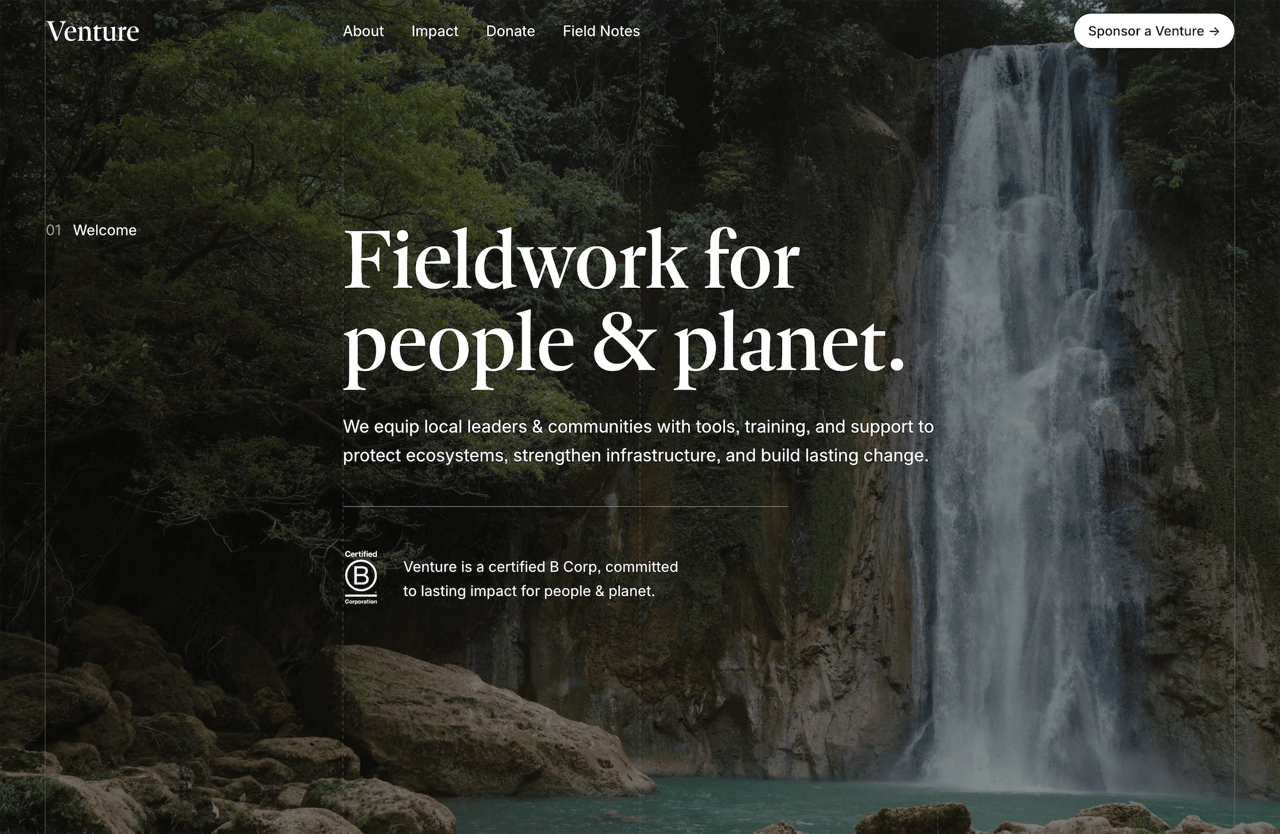
Venture is built for organizations that lead with impact. It has a bold homepage structure, clear program sections, a team page layout, and a donation-friendly CTA architecture. The design projects credibility while staying warm and accessible.
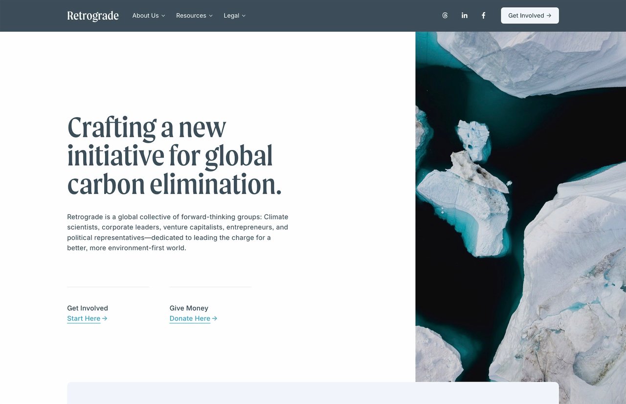
Retrograde takes a quieter approach—more editorial, with generous white space and strong typographic hierarchy. It works well for nonprofits in the arts, environment, or social services sectors where the visual identity leans restrained rather than bold.
Both include 15 launch-ready pages, deliver instantly after purchase, and come with lifetime email support.
Getting it done
The temptation with a nonprofit website project is to make it perfect before launching. A full redesign discussion, a committee of stakeholders, multiple rounds of copy revisions, and a launch that keeps getting pushed back.
Your donors, volunteers, and the people you serve need to be able to find you online. A solid, clear, working website that goes live in a reasonable time is worth far more than a perfect one that's perpetually in progress.
Start with the six or seven pages that matter most—home, about, programs, donate, get involved, news, contact—and get them right. The rest can come later.