Why Squarespace works for agencies
Agencies tend to overthink their platform choice. Webflow gives more design control. WordPress gives more extensibility. But for most small to mid-size creative agencies, Squarespace offers the right balance of design quality, ease of maintenance, and speed to launch.
The practical advantages: built-in responsive design so your portfolio looks sharp on every device, native blog and SEO tools for content marketing, SSL and hosting included, and a visual editor that lets anyone on the team make updates without calling a developer. When your business is client work, the last thing you want is spending billable hours maintaining your own site.
The trade-off is less granular design control than a fully custom build. But with a well-chosen template and thoughtful content, a Squarespace agency site can look every bit as polished as a custom one.
Pages your agency site needs
Homepage
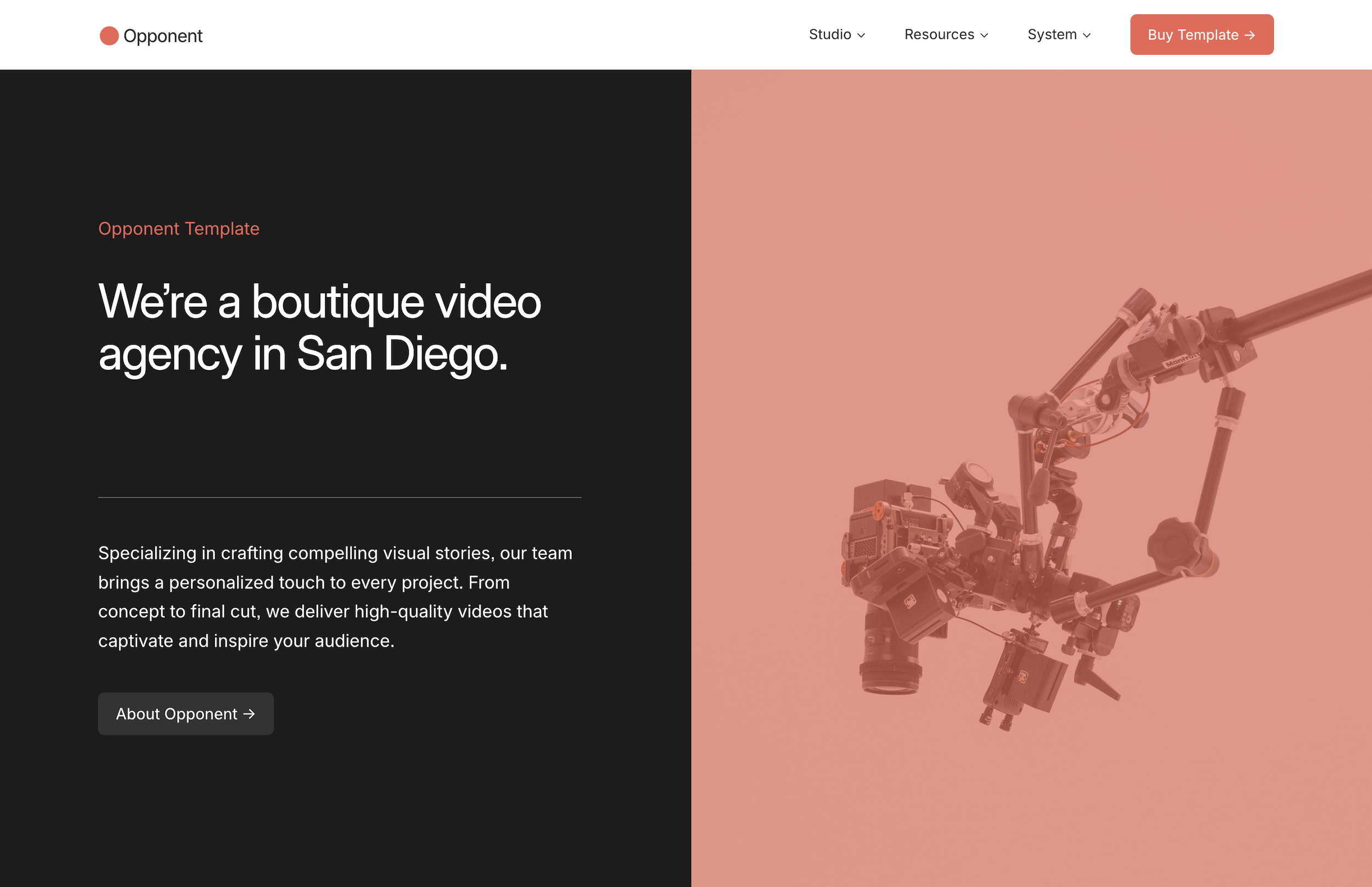
Your homepage has roughly five seconds to communicate three things: what type of work you do, who you do it for, and whether the quality matches what the visitor is looking for. That means leading with work, not with words.
The strongest agency homepages open with a curated selection of portfolio pieces, a clear headline that positions the agency, and a direct path to learn more or get in touch. Resist the urge to pack the homepage with client logos, team photos, awards, and a mission statement all at once. Let the work speak first, then support it with credibility further down the page.
For principles on structuring your homepage effectively, read Homepage Design Principles: What to Put Above the Fold.
Portfolio or work page
This is the most important page on your site. It's where potential clients decide whether your taste, skill level, and style are a fit for their project.
Organize by project, not by medium. Visitors care about outcomes, not categories. A page organized as "Brand Identity," "Web Design," and "Print" forces people to click through multiple sections to understand the scope of a single project. Instead, present complete case studies that show the full breadth of what you delivered.
Curate ruthlessly. Eight strong projects will always outperform twenty mediocre ones. Every piece in your portfolio should represent the type of work you want more of. If you're trying to move upmarket or into a new vertical, lead with the work that signals that direction, even if it means cutting older projects you're still proud of.
Include context, not just images. A grid of pretty images is a mood board, not a portfolio. Each project should include at minimum: the client name (with permission), a brief description of the challenge, what you delivered, and the results if available. This doesn't have to be a full case study on every project, but bare-minimum context helps visitors understand the strategic thinking behind the visuals.
For a deeper dive on presenting client work, the principles in How to Create a Services Page That Converts apply to framing portfolio pieces as well.
Services page
Many agency sites skip the services page entirely, assuming the portfolio speaks for itself. That's a mistake. Potential clients want to know specifically what you offer before they reach out. Are you full-service or specialized? Do you handle strategy, or just execution? Do you build websites, or only design them?
Structure your services page around the types of engagements you take on, not a laundry list of deliverables. Instead of listing "logo design, brand guidelines, business cards, letterhead, social templates," group it under "Brand Identity" with a paragraph explaining what that engagement looks like, what's included, and who it's for.
If your agency offers packages or tiered pricing, include that here. If pricing is project-based, say so and explain what drives the cost. Transparency builds trust, and it filters out inquiries from people who aren't a fit.
About page
For creative agencies, the about page is where you build trust and differentiate. Your portfolio shows what you make. Your about page shows who makes it and why they're the right team for the job.
Include: a short agency story (how and why the agency started), the team with real photos and brief bios, your approach or process, and any relevant experience or credentials. Keep it honest and direct. Agencies that describe themselves as "a collective of passionate creatives disrupting the paradigm" aren't saying anything. Agencies that say "a four-person branding studio in Austin that works primarily with food and beverage brands" are.
Blog or journal
A blog serves two purposes for an agency: SEO and credibility. Writing about your process, sharing behind-the-scenes looks at projects, or publishing perspective on industry trends signals expertise and gives search engines content to index.
You don't need to publish weekly. A monthly post that's genuinely useful or interesting is better than weekly posts that feel forced. Write about things your potential clients actually want to know: how to prepare for a rebrand, what to expect from a web design project, how to evaluate creative proposals.
For SEO fundamentals, The Complete Guide to Squarespace SEO covers everything you need to get your blog ranking.
Contact page
Your contact page should be simple and direct. Include a contact form with a dropdown for project type (branding, web design, content, general inquiry), your email, and any relevant location or timezone information.
Don't require a detailed project brief on the contact form. The goal is to start a conversation, not to collect a complete scope of work before you've even talked. For more on building forms that get submissions, read How to Create a Contact Form That Actually Converts on Squarespace.